Welcome back, onehappybird watchers! Wow, what a crazy week of coverage of our post about how happiness varies by city and state across the United States. Many, many people read, shared, and commented on the post, for which we are grateful. For the detailed explanation of the results, check out the full paper we recently submitted to PLoS ONE.
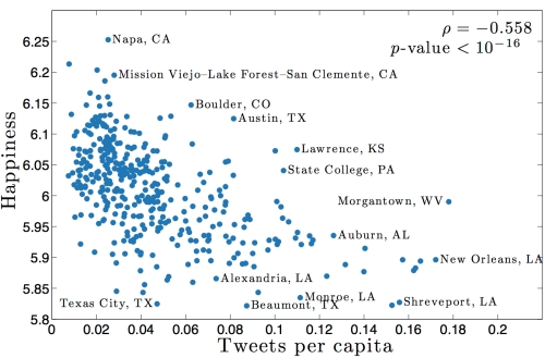
A number of readers wondered how variations in happiness relate to different underlying social and economic factors. To try to answer this question, we took data from the 2011 census (all helpfully available online on the Census Bureau's American FactFinder website) and correlated it with our measure of happiness. Surprisingly, happiness generally decreases with the number of tweets per capita in a city (this doesn't mean that tweeting more will make you less happy, it's only a correlation):
Next, we grouped covarying demographic characteristics obtained from the census, and looked at how these clusters varied with happiness. For example, it might not surprise you that cities with a larger percentage of married couples also contain a larger percentage of children - this is what we mean by covarying demographics. And you might or might not be surprised that more marriage is positively correlated with happiness. There's plenty of scatter but the connection is there:
Scatter plot of happiness vs. percentage of population married. Each dot represents one city, the rho and p-values reported are Spearman correlations.
We used an automated algorithm to bin the census data for us into eight groups and then compared the happiness of those groups, leading to the following figure:
Each point represents a characteristic from the census (for example, the % married/happiness plot above is now represented by one point in this figure), with the horizontal groupings representing covarying demographic characteristics. A point's position on the vertical axis shows how that characteristic varies with happiness across all cities. A positive value means that happiness is higher in cities where that characteristic is higher, while a negative value means that happiness is lower in cities where that characteristic is higher. For example, the figure shows that as the percentage of married couples in a city increases, so does the average happiness of that city (no causality is implied).
Only two groupings (the colored dots on the far left and right) showed strong correlation (either positive or negative) with happiness. Looking at which characteristics make up these groups, it appears that the general story here is a socioeconomic one, and one that holds only at the extremes. With our peculiar Twitter-based lens, we see money statistically correlates with happiness, which is not quite as catchy as "money buys happiness" (see the debate over the Easterlin Paradox for more). You can delve into the data yourself - the correlations of all 432 characteristics of cities recorded by the census with happiness can be found here (page best viewed using Google Chrome).
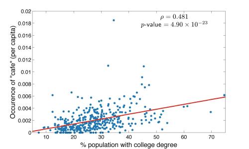
A more interesting question might be how word usage varies with different demographics - to do this we correlated each word with each demographic characteristic across all 373 cities in our dataset, leading to a lot of data to sift through! (And you can too, by following the link in the above paragraph.) As an example, take a look at how the word "cafe" varies with the percentage of population with a college degree:
Each point in the figure represents one city, and broadly the trend is that the more "college-y" the city is, the more people talk about cafes online. (You can decide for yourself whether that's surprising or not). The top 10 emotive words whose usage went up as percentage of population with a college degree went up turned out to be:
- cafe
- pub
- software
- yoga
- grill
- development
- emails
- wine
- art
- library
And the emotive words which went up as college degrees went down?
- me
- love
- my
- like
- hate
- tired
- sleep
- stupid
- bored
- you
We saw similar patterns of word use across many socioeconomic characteristics—emotive words and words about interpersonal relationships ('me' and 'you') at one end of the spectrum, and words about more complex social or intellectual themes at the other. Interestingly, we find more food-related words in this group as well.
Of course, all of this is open to interpretation. As many commenters last week pointed out, Twitter users (indeed, specifically those users who geotag their tweets using a mobile device) are a small, non-representative sample of the global population. Furthermore, our method is undeniably crude, and by breaking texts up into their constituent words ignores the context in which those words were used. That said, many of these results agree with our intuition (for example, many of the cities with low happiness scores also appeared on a list of America's "most miserable cities" published late last week by Forbes), while some surprise us. There is certainly a lot to be learned by looking at what the data can tell us, and we encourage you to do so by exploring our website of supplementary data. Again, you can read the full technical details in our research paper here.
We'll pick up on the theme of food again in our next post, which will focus on one important health factor relating to happiness—obesity.


