
Last month we looked at the problem of measuring topic sentiment with social media data, and specifically how a naive approach to the corpus creation stage of the process can introduce irrelevant documents. We saw that sentence embeddings provided good feature separation for filtering an overly inclusive corpus. Today’s post will explore building a pipeline from data labeling to classifier training.
Data Labeling
By labeling the data, we mean distinguishing between tweets relevant to our topic of interest from those that are unrelated but contain a keyword with a distinct meaning. For the solar case study, we found a number of irrelevant topics from weather bots discussing solar irradiance, to astronomy fans tweeting about the solar system.
The data labeling interface is the first choice we need to weigh. Our options vary in complexity and sophistication, from opening a file in Excel, to manually coding tweets, to specifically designed task interface software.
For a single human coder, a spreadsheet offers the lowest start-up costs. Simple changes like turning on cell text wrapping help significantly with reducing cognitive load. Binary relevance labeling rates can reach 30 tweets per minute. Simplicity comes with trade-offs however when it comes time to scale up. Coders have to avoid typos, or potentially overwriting data cells. There is also no support for features like inter-rater reliability (IRR) or active learning.
Purpose built data labeling software provides some of these features with higher startup costs. One open source project we evaluated was SMART: Smarter Manual Annotation for Resource-constrained collection of Training data. SMART provides a web based user interface for the entire labeling process that we have currently set up at hydra.uvm.edu:8000.
The experience for a coder is that the interface is a bit clunky. For example, when labeling is done with the mouse, the buttons change position on the page depending on tweet text length. Additionally, it seems to have performance issues writing labeled data to its internal database, leading to periods of frustrating non-responsiveness. These factors limit labeling rates to 5-10 tweets per minutes. It’s not immediately clear if the performance issues could be resolved by moving the process to a faster machine or by changing performance settings. Outstanding issues on the projects github page from 2018 suggest the bugs won't be resolved soon.
Some commercial alternatives are worth exploring should we decide we want to use distributed coders and IRR. Light Tag offers free individual coding, and up to 10K free annotations per month and $0.02 per annotation after. Amazon SageMaker integrates with Amazon Mechanical Turk to provide both software and labelers. Prices are $0.08 per document for the platform, and roughly $0.012 per document label, adding up to ~$0.12 total per document.
Classification Pipeline
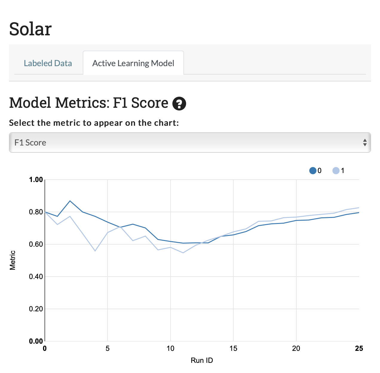
Out of the box, bag of words classification pipelines don't seem particularly promising for distinguishing relevant and irrelevant tweets. The random forest classifier working with Term Frequency, Inverse Document Frequency (TF-IDF) features was able to achieve an F1 score of only around 0.8, or an accuracy of 81% after labeling 500 tweets. This is an improvement over no labels, but we can do better.
Exploiting recent pre-trained sentence embeddings, we can achieve an F1 score of 0.97% for this classification task on "solar" tweets. This is successful classifier, though performance might not be as high for all keywords.
Curated corpus comparison
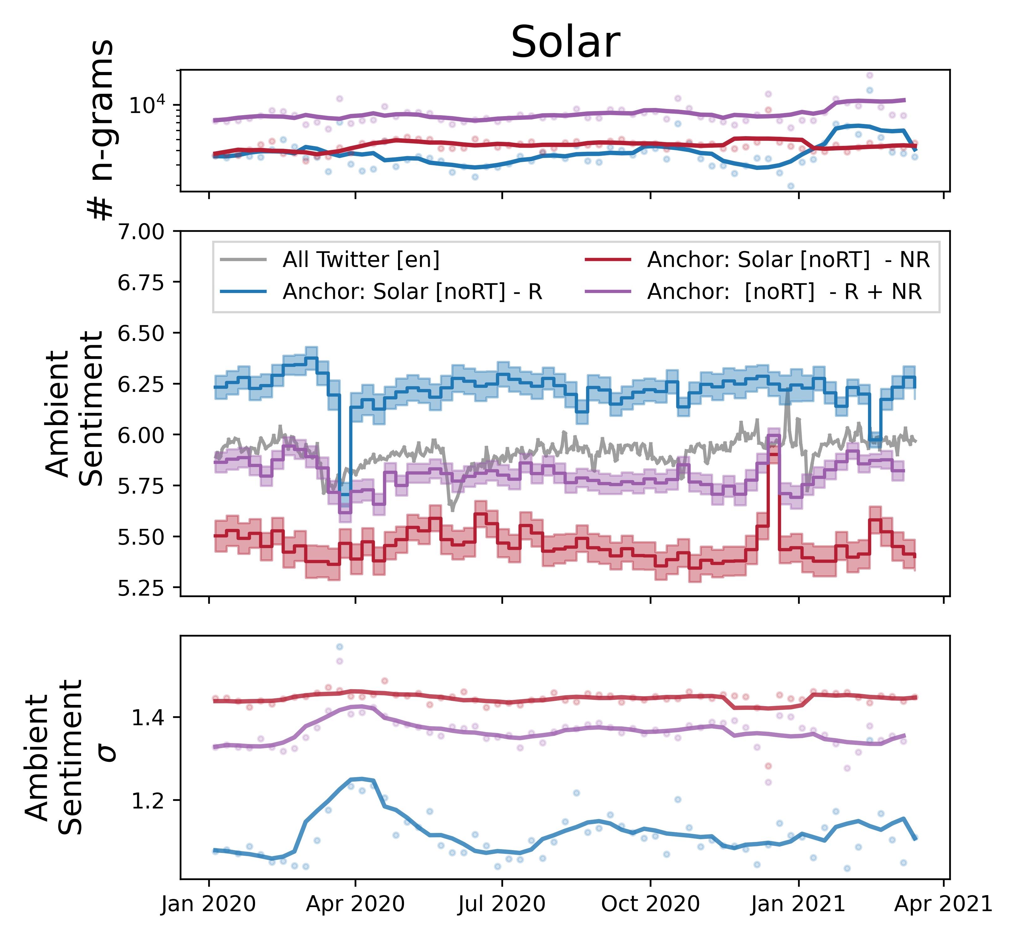
Once our model is trained, we can run inference to get labels for a much larger dataset than we could hope to label manually. Running measurements only on the relevant tweets, let's explore how standard ambient sentiment measurements change.
The filtered corpus including only relevant tweets is shown in blue and referred to a relevant (R). The discarded corpus is shown in red, and labeled not relevant (NR). The naively queried tweet corpus without filtering is shown in purple, and marked as R + NR.
The top sentiment time series panel shows the volume of LabMT ngrams in each time step. Tweets classified as not relevant have a stable volume over time, while tweets relevant to solar energy have more dynamic behavior. The naive query (R + NR) has more volume as expected, since it's the union of the other two corpuses.
The ambient sentiment in the middle panel shows that our naive R + NR measurement is a weighted average of both relevant and not relevant tweets.
For naive queries, this suggests that we should be concerned about two kinds of errors. First, changes in the volume of unrelated tweets could introduce what appears to be a change in sentiment, even if the sentiment of language around relevant tweets is not changing. Second, the weighted average smooths out large shifts in sentiment that are visible when we include only relevant tweets.
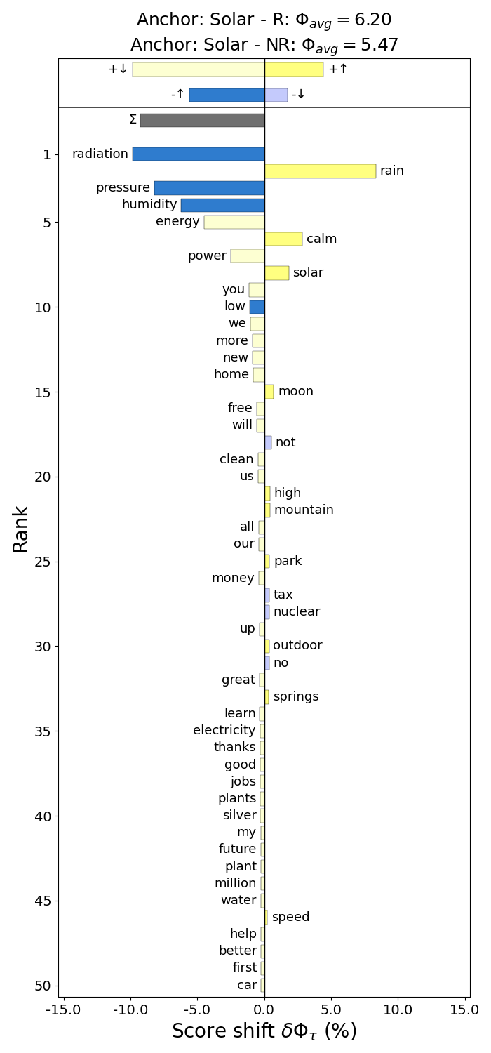
We can directly compare how frequently word tokens occur in classified tweets, using a rank divergence plot. 1-grams that occur with higher frequency in tweets labeled as relevant to solar energy, show up on the left, with energy, panels, power having the highest rank divergence contribution. More frequent in not relevant tweets are 1-grams like mph, uv, and weather, which commonly occur in weather bot tweets, unlikely to be useful in estimating public sentiment towards solar energy.
The lower sentiment values for the NR corpus relative to the R corpus is driven by more frequently used words like radiation, pressure, and humidity, which all have lower than average scores. The positive words energy and power are also used less in the NR tweets.
Suitability for unsolicited public opinion polling?
Between the measured accuracy of the classifier and the sanity checks comparing the filtered relevant and not relevant tweets, we can be confident that the classifier is improving the quality of the corpus. But how well does the sentiment measurement capture Americans' changing views on solar energy?
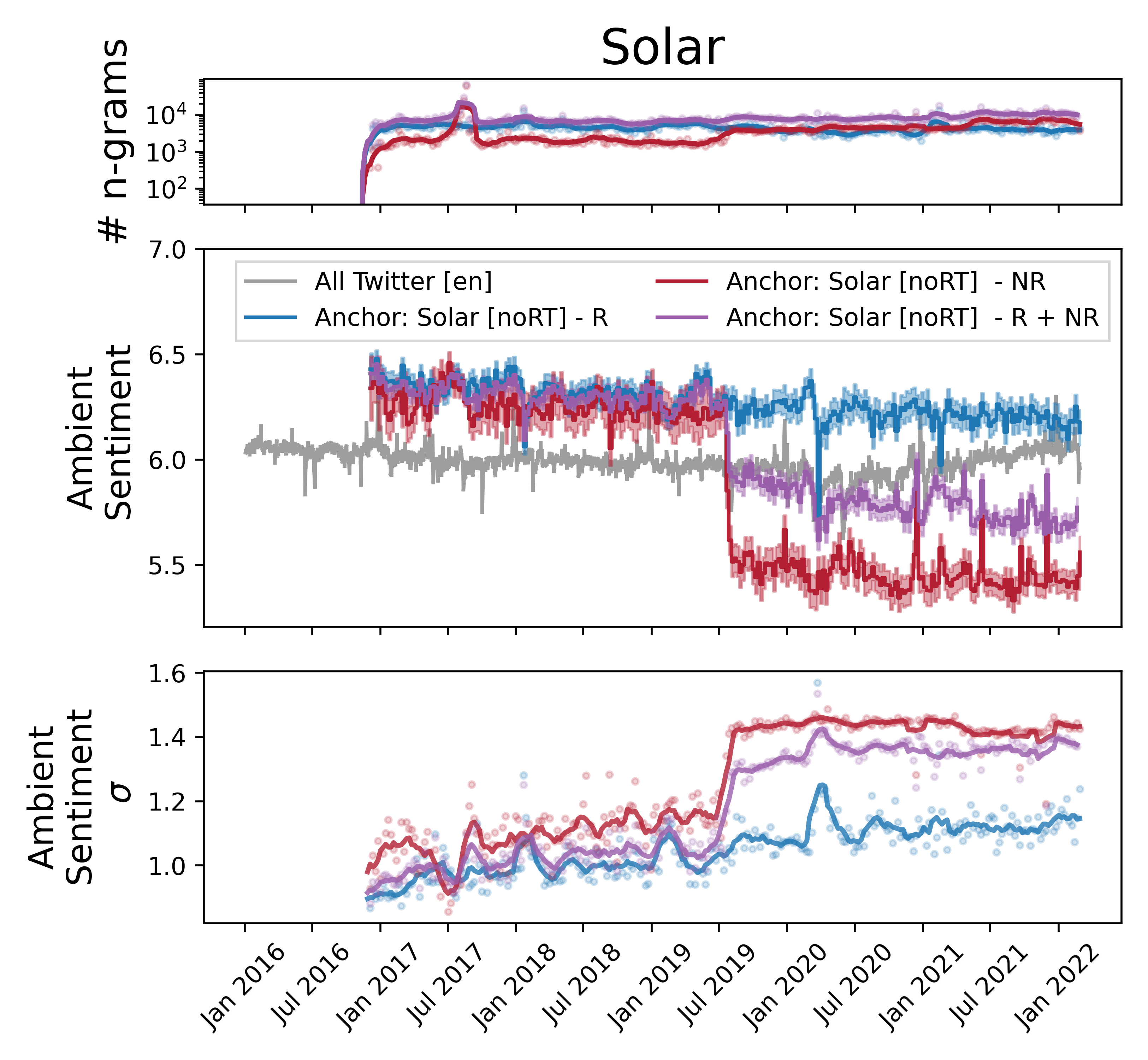
We do see a small decrease in sentiment from 2016 to 2022, along with increasing sentiment standard deviation, which suggests there is more polarized language being used around solar energy. Without the ability to classify tweet authors as likely Republicans or Democrats, we can't reproduce the Pew survey, but our measurements seem consistent with the traditional survey methods.
Importantly, our analysis of tweets specifically classified as relevant were less dramatic than the initial results with a naively queried corpus. The naive measurement, shown in purple, shows misleading drops in sentiment in mid-2019 due to weather bots.
So long as the costs of labeling tweets and training a classifier can be kept reasonable, this pre-processing step of corpus curation seems to be worth incorporating into standard social media NLP pipelines.