

Imagine commuting an hour to work, one way, grinding through miles of traffic to get from your suburban home to a desk job in the big city. Excited yet?
Ok, now imagine that you lead a life of leisure traveling the world. You fly coast-to-coast to see a concert, soak in some culture, and drink fine wine. Does this lifestyle seem more appealing?
Lets try to quantify the influence of these travel patterns on individual happiness. We do this using geolocated tweets, which we have previously used to reveal the happiness of cities, and to quantify patterns of movement.
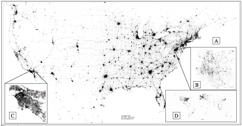
Each point corresponds to a geo-located tweet from 2011.
(A) USA (B) Washington, D.C. (C) Los Angeles (D) Earth
First, we find the average location of each individual's tweets. We call this their expected location. Then we draw circles emanating from this spot, like rings on a dart board. Some messages are written close to home, others from very far away.
Then we collect all of the words written at each distance, roughly 500,000 tweets per ring. Averaging the happiness of words found at each distance, remarkably we find that happiness increases logarithmically with distance from expected location. Tweets authored far from home contain a smaller number of negative words.
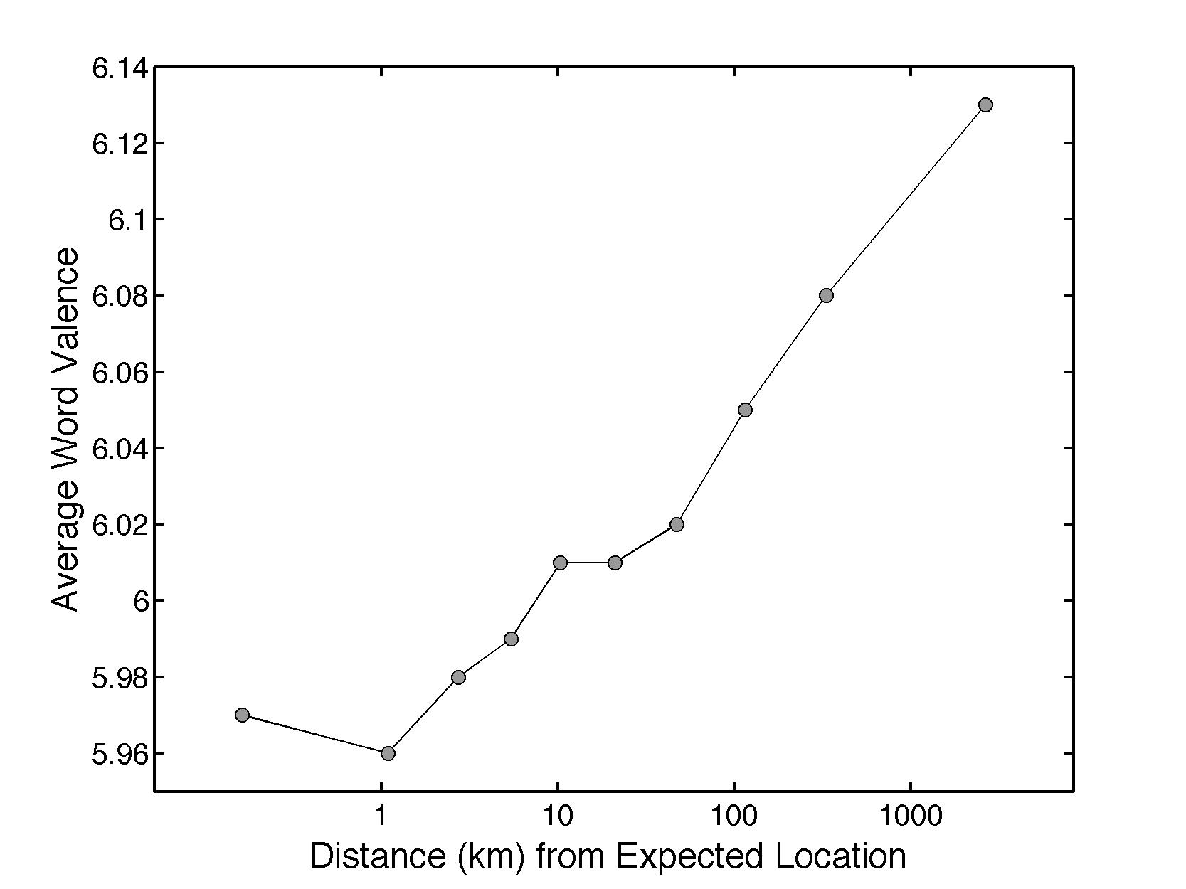
Tweets are grouped into ten equally populated bins by the distance from their author's average location, and the average happiness of words written at each distance is plotted. Expressed happiness grows logarithmically with distance from home.
Home is where the hate is? What? No.
Below we look at the difference between the happiest and saddest distances from home. Words appearing on the right increase the happiness of the 2500km distance relative to the 1km distance. For example, tweets authored far from an individual's expected location are more likely to contain the positive words “beach”, “new”, “great”, “park”, “restaurant”, “dinner”, “resort”, “coffee”, “lunch”, “cafe”, and “food”, and less likely to contain the negative words “no”, “don't”, “not”, “hate”, “can't”, “damn”, and “never” than tweets posted close to home. Words going against the trend appear on the left, decreasing the happiness of the 2500km distance group relative to the 1km group.

Word shift graph comparing the lowest average word happiness distance group to the words authored farthest from home.
Tweets written close to home are more likely to contain the positive words “me”, “lol”, “love”, “like”, “haha”, “my”, “you”, and “good”. Moving clockwise, the three insets show that the two text sizes are comparable, the biggest contributor to the happiness difference is the decrease in negative words authored by individuals very far from their average location, and the 50 words listed make up roughly 50% of the total difference between the two bags of words. For you visual learning folks, here is a short video explaining how these word shifts work.
Take home story: people tweeting far from home talk about food more, and they swear less than people tweeting close to home. These people are probably enjoying awesome vacations, and tweeting about it!
In summary, if you are a fellow with a daily commute that makes you feel a little bit sad, you are not alone! Try swearing less. Or ride your bike.
If you are lucky enough to travel often, then keep smiling...maybe send the rest of us some pictures to cheer us up!
For more details on our analysis, check our paper “Happiness and the Patterns of Life: A Study of Geolocated Tweets” recently published in Nature Scientific Reports.