Today we're pleased to announce that our article “The Geography of Happiness: Connecting Twitter sentiment and expression, demographics, and objective characteristics of place” has been officially published by PLoS ONE. We wanted to tell you about one key piece we've added to the paper and an unusual new Twitter account we've created.
After our three blog posts (which coincided with the release of the preprint), we received plenty of media attention, as well as some fantastic feedback from readers (thanks!). One very important question kept coming up: “How well does happiness agree with other measures of well-being?”, or more simply: “Why should we believe you?”
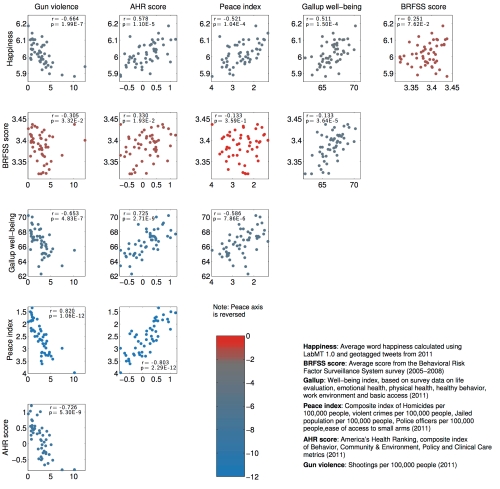
Well, we're glad you asked. For the final paper, we've added a US state-level comparison between our happiness measure and five other kinds of well-being indices:
- the Behavioral Risk Factor Surveillance Survey (BRFSS) for which people were asked to rate their life satisfaction on a scale of 1 to 4 (the BRFSS was explored in this Science paper on well-being from a few years back);
- Gallup's health survey-based well-being index;
- the Peace Index, which aggregates various crime data;
- the America's Health Ranking, which aggregates health data; and
- gun violence, specifically the number of shootings per 100,000 people.
In the figure below, we show a series of scatter plots comparing all pairs of well-being metrics (happiness runs along the top row). Each dot represents a US state, and the colors represent strength of correlation or agreement between measures, with blue meaning strong agreement, and red representing no (statistically significant) agreement. (We include the exact Spearman correlation coefficient r and p-value in each scatter plot.)
Scatter matrix showing comparison between different well-being metrics for all US states. The top row shows comparisons with happiness. Colors indicate the strength of correlation between pairs of metrics; shades of blue indicate increasingly significant correlation.
Looking at the top row, we can immediately see that happiness agrees with all measures except for the BRFSS. However, the BRFSS itself doesn't agree with any other measure except for the Gallup well-being index. The most striking departure was the BRFSS ranking Louisiana as the happiest state whereas our happiness measure placed it last. There are a number of possible explanations for these disagreements: one is that the BRFSS data was taken between 2005 and 2008, while all other data is from 2011 only; another is that unlike the other measures, happiness is self-reported in the BRFSS. How would you answer if asked how happy you are? Do you expect that your answer is representative of the population you live in at large? There are certainly many different ways to define “happiness”, as a number of different readers have pointed out.
Of course, this is not to criticize the BRFSS (it remains a significant data source, and Oswald & Wu did fine work analyzing it in their Science paper), but merely to suggest that our word happiness score is measuring something different but perhaps complementary to traditional survey-based techniques. There certainly appears to be plenty of value to observing people “in the wild” via social network data, e.g. with the real-time instrument hedonometer.org.
Finally, to celebrate the publication of our article we created a Twitter feed, @geographyofhapp, dedicated to tweeting the happiest and saddest city every day, and we invite you to follow. We're hoping that this is the first research article with its own Twitter account, but perhaps not hoping that it represents the future of scientific publishing...
Researchers @hedonometer measure happiness - interview @Science360 Radio: http://t.co/jIGI1ng66i pic.twitter.com/JdDHYI1ZaE
— National Science Foundation (@NSF) March 23, 2015


